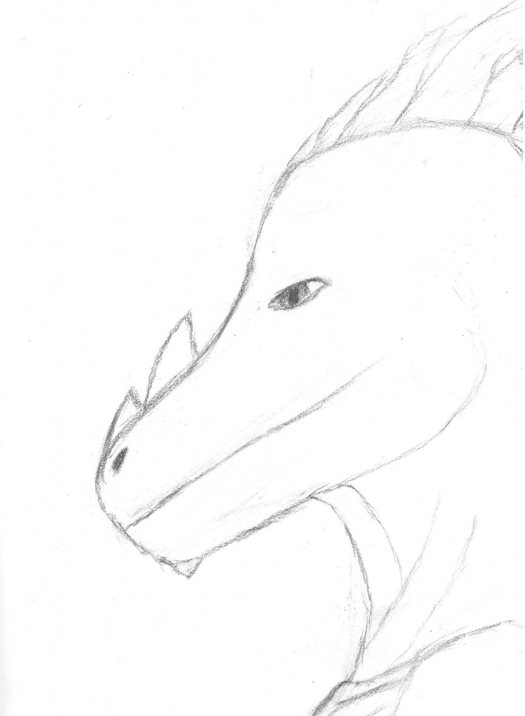
To give some minor advice. The eye of your fursona should be further down, otherwise it's located on his forehead. I took the liberty to make a change for you to see, I'm not saying that it's the best place but I just did it to give you a visual.

For the acrylic I have some difficulties understanding your shading. Most often you shade to get a sense of light and depth, as it is now I have difficulties to see where the light comes from. I think it would help to decide (before drawing detail and texture) where it should be in shade and where it should be lit.
http://browse.deviantart.com/?q=shading#/d45i1k3 Here is a good tutorial

For your computer work. Your lines are very precise witch is both good and bad. It can make it a bit lifeless and way too clean for a character. And then you shade with very gradient lights. You see the conflict? Very clean precise lines coupled with gradient shading makes for conflict in the style. I'm not saying that it can't work of course.
http://browse.deviantart.com/?q=line+tutorial#/d2mslk5 Look at the fourth (4) picture. See how the lines are of different thickness and flow and smoothness? That creates more life.
Keep on drawing!
