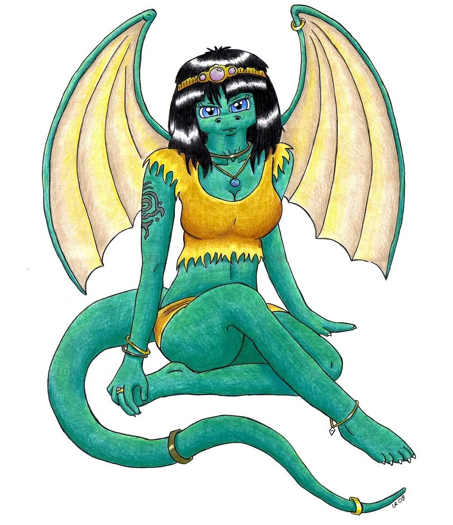
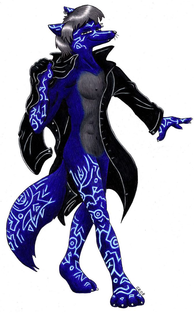
Thanks for the nice comments, all.

Yes, my files are definitely JPEGS, I never use bitmaps. I've tried resizing before linking but it doesn't seem to help. I'll keep trying to figure it out I guess.
As for the richness of colour, well, all I can offer advice-wise is use good pencils and paper. I use Prismacolors, which are damn expensive for pencils, but they are the most amazing things to work with. But don't worry, you can get just as rich a colour lay-down with Crayolas. Cheaper pencils might not be as easy to blend, but if you are firm with your colouring, the results will still be effective.
Here's an example. I drew this with an $8 box of crayolas:

The best tips I can pass on, that I were taught to myself by the good grace of other artists. are;
1. Be liberal with colour. I mean, go crazy. If you're drawing a fox, don't just find a nice brown and colour it. Colour it brown, then red, then orange, then another brown, then shade with another brown, then blend the edges with white, then highlight with yellow... Seriously, go nuts. There's no such thing as too much colour. If you plaster an area with several shades it will leap off the page and come to
life. Try it.
2. Paper quality is MORE important than pencil quality. I spend more on paper than on pencils. You want a strong, thick paper, at least 160gsm, and as smooth as possible. I've seen artists do amazing things with textured paper, but personally I like a smooth page. If the paper is smooth the colour is flat and bold. Colour firmly, don't be scared of breaking your pencil, and if you have trouble colouring in one direction, crosshatch.
3. It might seem obvious, but use black LAST! If you outline like myself, make it the final step. Also, don't be afraid to shade with black.
4. I learnt myself, through trial and error, the best way to get your drawings from paper to computer. Scanning inevitably reduces the quality, but all you need to do is use a graphic program to adjust the brightness/contrast. Simply scan your drawing, open it in your graphic program, and use the tools to increase the contrast by 30 and reduce the brightness by 25. Well, that's what works for me anyway. Some scanners might be able to do it for you. Just muck around until it looks good.
Here was my very first drawing with Prismacolor pencils:

I still have so much to learn. So many times I have drawn a picture, stood back and looked at it and thought "That's it! Perfect!" only to look at it a week later and think "What the hell was I thinking?" Part of being a good artist is constantly trying to improve and never being happy with what you can do. Okay, I might be wrong, but that's my humble opinion.


