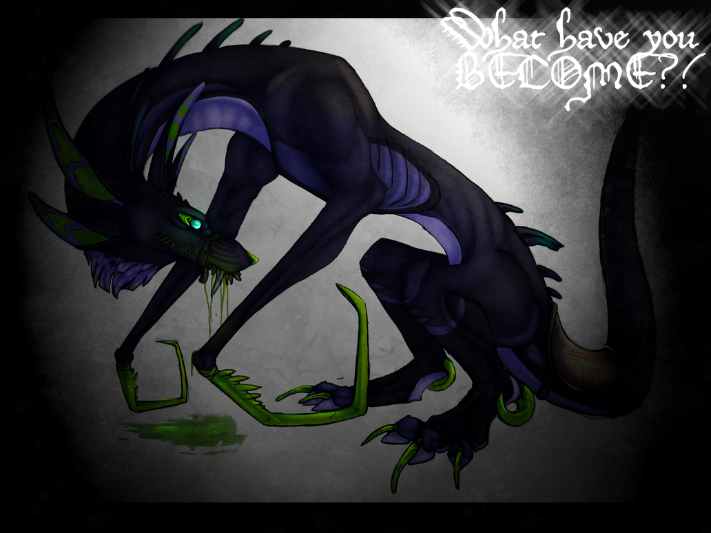
You're still doing quite well with the new arts. Nice job. 
If you don't mind me giving a suggestion though, you might want to play around with how you shade/highlight on black. It's a pretty tricky thing because people's monitor settings can greatly change how it looks, but on my screen at least, it's a little difficult to identify the detail in the black areas of some of your drawings. You may want to consider lightening the black just a touch so you can better see the detail. Like, if I look really closely at that most recent one, I can mostly see the lines and details of the facial expression, but it's really hard to quickly identify what expression she's making exactly.
Usually when I'm coloring with black I use dark grey (or sometimes a really dark version of another color, depending on the lighting). Adding shadows to the dark grey is what will make it look black instead of dark grey.
And maybe it is just my monitor and it's clearer for you, I dunno. Hope it helps in some way though. c:
Thank you Zeph!
And thank you for the suggestion.
I don't usually use black though, that's the thing. I usually use a dark blue, which I believe I did with this. I try not to use pure black, white or the shades in between, looks much nicer to use off whites or dark colors to resemble black, imo, and I find it much easier to shade.
For me, it is indeed quite clear though, her snout isn't very dark on my monitor, it's in fact tinted green, as I intended it to be.
Silly computers. Herp.
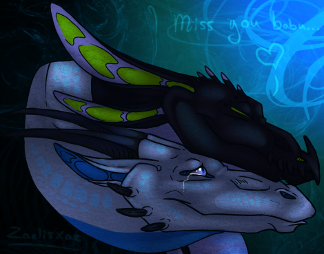
This next pic, I wouldn't be surprised if it's hard to see on your monitor, Zeph.

As Some spots are hard to see on mine, lol.


By the way Zeph, if anyone can answer this question for me, I think you could.
When I shade darker colored images, it makes the shading really fuzzy and unfocused, kinda pixely. Do you know what causes this, or how I can avoid it? Thanks~


