I really love gender stereotypes taken to extremes, like the Tank and Witch from Left4Dead, or the brothers and sisters from The Void
So here's my concepts for the third main character of my webcomic.
Oh yeah and I love robots.
http://www.furaffinity.net/view/3885265http://www.furaffinity.net/view/3885274/There is one comment on this thread that I forgot to address, and I really wanted to because it allows me to talk about my favourite artists.
Yeah that looks pretty good actually, you do nice brush effects together and makes me think of some sort of hybrid Vincent Van Gogh with modern techniques in the power of bunny paws 
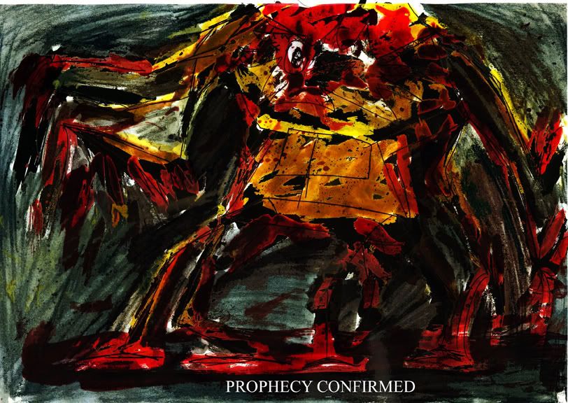
I can see where the Van Gogh similarity appears, but I certainly didn't try to move with the old master. Primarily my style arises from my own erraticness, my energy, my hyperactivity. I don't stay on things for too long, and I like it when there is a lot of movement to a picture. When I first really started experimenting in this direction, I pushed the movement as far as I could and one of my graphic design teachers loved it, while the other realised that nobody else could see what on earth was going on. I toned it down and ended up with a comic book, of which the last page was this:

Now think about it. That's what it looked like when toned down. Imagine how it used to be, with about twice or maybe three times the confusion.
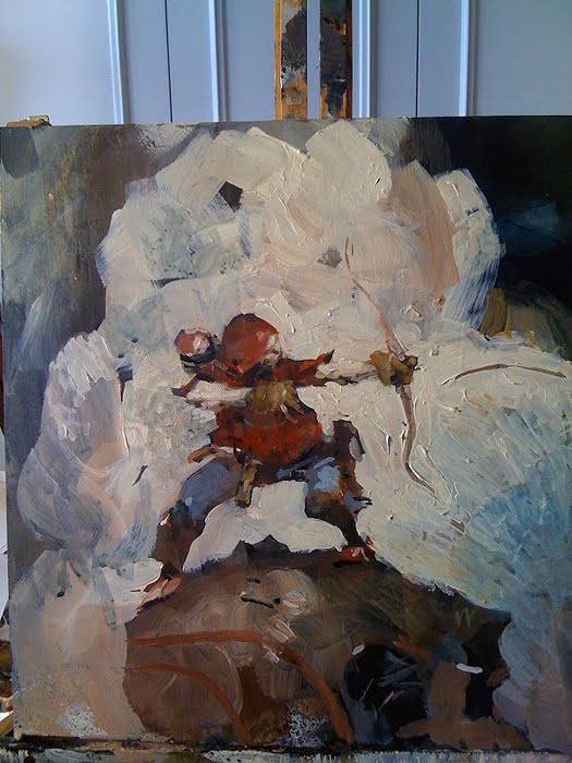
I still toy with the extremes from time to time, but... well you've seen what I normally produce. As you all well know, initially I would draw something out in pencil, then pen, then colour it in. I used to use real paints which would sometimes run away with me and my erraticness. It ends up creating an unintelligible mess, often with only one or two overriding colours. There's a certain lack of control that I don't like. Also, it was big, expensive and messy. So instead, I went with painting on photoshop, which only required lots of scanning in of drawings. I didn't like doing that either because once it's on the computer, I can't change the original linework particularly easily. It always comes off as an unconvincing patch job. As well as that, the linework in pen was always quite rigid and smooth, leaving very little movement and life that the original pencil sketch had.
One quote that always comes to mind is from Ralph Steadman, artist of Fear and Loathing in Las Vegas. I think he said something like
I don't like going over things in pen, because the drawing loses its life.

(the White Rabbit, by Ralph Steadman)
I definitely got inspired by him to do things strangely. I started drawing straight off in pen, but then found mistakes utterly irreperable, though some were rather pleasing. Eventually a picture gets filled with so many mistakes that I end up back where I started, not knowing where anything is anymore. I found this method of artwork unsustainable though it did bring forth some of my longest lasting characters.
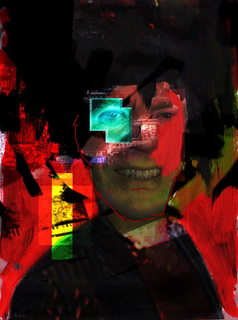
(I should say now that I'm not doing things chronologically, but more thematically, however, that said, this is a good place to point out my other inspiration at that time was the sculptures of Nicolas Caesar. They're strange, twisted, dark and very imaginative. I also toyed briefly with the style of Dave McKean, illustrator of the Sandman comics. In fact, here's what I came up with:

Yes it's... odd, but it was an experiment after all. Anyway, moving on:)
I found this strange, twisted and permanent world of art to not fit right with my "style," even though I didn't know what that style was. I went back to pencil and paper drawings of very neat, very static characters, and felt as though I was going backwards, betraying my artistic sensibility.
All this changed after watching an episode of
Friday Night with Johnathon Ross. They were interviewing the Gorillaz, Damon Albarn and Jamie Hewlett. Being the comic book fan that he is, Johnathon Ross focused on Jamie Hewlett's past as one of the creators of Tank Girl. Since I absolutely loved the art for the Gorillaz, I decided to check it out. One of the first things I found was a news story about how Tank Girl was being revived, and the first new volume, called Tank Girl: The Gifting was to be illustrated by a man called Ashley Wood. This was the front cover:

I was intrigued, so i went to his blog, and stayed there for the next 6 hours, just looking through his art. It was beautiful.

This is one of his more expressive yet simplistic pictures, and he has plenty of detailed and realistic ones... but just look at that. It's stupid and awesome in equal measure. That's what I want.
So right now, he's my main influence. He's where I want to be. I want that impact, I want that skill, I want that movement.
I've a long way to go from here, but then I've only just started.


